Crown Vintage
Rolex Datejust 1601 'Grey Sigma Dial' 36mm 1974
Rolex Datejust 1601 'Grey Sigma Dial' 36mm 1974
Couldn't load pickup availability
Rolex Datejust 1601 'Grey Sigma Dial' 36mm 1974
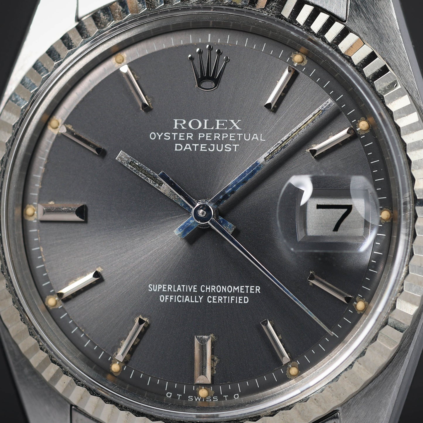
Presented in very good overall condition, this 1974 Rolex Datejust 1601 with grey sigma dial retains sharp case geometry with light hairlines visible in normal light. The lugs are extremely crisp with clear factory brushing, and there are no dents or deep marks noted. The fluted bezel presents cleanly with minor handling on close inspection. Acrylic crystal is clear and free of distracting scratches. The Jubilee bracelet is very good with only some stretch; light hairlines are present on links and clasp, and it secures firmly. The grey sigma dial shows light, even oxidation with a pleasing patina; printing is crisp, applied markers and coronet present neatly, and the σ flanking SWISS at six is intact. Hands are lightly oxidised with tidy luminous fill and correct alignment. Crown action is positive, and time and date setting operate as expected during handling. Given its age, treat this as a vintage timepiece and avoid water exposure or wearing whilst swimming.
Share
Why we love this watch
Why we love this watch
Rolex Datejust 1601: Early 1970s Focus and the Story of Sigma Dials
Introduction
Produced between 1959 and 1977, the Rolex Datejust 1601 is the archetype of the post-war Oyster Perpetual with date, pairing a 36 mm case with fluted precious metal bezel, automatic movement and cyclops over an acrylic crystal. While the reference spans nearly two decades, the early 1970s stand out for subtle but important evolutions in mechanics, typography and dial furniture. This period also introduces one of the most discussed details on mid-century Swiss watches: the sigma signature at six o’clock. On a 1601, those tiny Greek letters frame the word SWISS to indicate solid gold dial furniture. Understanding why sigma appears, how it is rendered, and where it fits within the wider Datejust story turns an already iconic reference into a precise study in Rolex design language during a transitional era.
Where the 1601 Sits in the Datejust Lineage
From bubble-back DNA to modern daily wear
The Datejust story begins in the mid 20th century with the concept of an automatic, chronometer-rated Oyster that displays the date in a magnified window. The 1601 is the fully evolved, post-1950s iteration that locks in the size, proportions and dial architecture most people now recognise. It keeps a classic three-hand layout with baton markers, the coronet at twelve, and clean horizontal balance across logo, model line and chronometer text. Compared with earlier references, the 1601 stabilises case geometry, sets a consistent 20 mm lug width and standardises the fluted bezel as the signature frame for the display.
A reference family, not a single metal recipe
Although many associate 1601 with a stainless steel case and white gold fluted bezel, the family extends to two-tone and precious metal executions. Rolex internal coding split variants by bezel alloy and case metal, but the core proposition remains: a 36 mm Oyster case with screw-down crown, screw-back, fluted bezel and date at three. Bracelets are typically Jubilee or Oyster; dials range from sunburst silver to linen textures, dark lacquers and rarer colours. That canvas is what makes the early 1970s so rewarding to study, because typography, lume, and dial metal cues converge in a distinctive way.
The Early 1970s: What Changed on the Wrist
Movement evolution
Inside a 1601 you will see the calibre 1560 in earlier production and the calibre 1570 in later years. By the start of the 1970s, 1570 is the norm. Around this time Rolex adds hacking seconds to many 1570-equipped models, allowing the seconds hand to halt when the crown is pulled for precise time setting. The movement remains non-quickset for the date, which means the date advances only by turning the hands past midnight. The beat rate, architecture and finishing are familiar Rolex territory, prioritising stability, amplitude and robustness. The tangible difference most people notice in day-to-day handling is the presence or absence of hacking.
Dial construction and the enduring pie-pan profile
One hallmark of the 1601 throughout the era is the stepped or pie-pan dial, where the minute track drops away at the perimeter. On early 1970s pieces the step remains crisp, giving light a break line at the edge that makes the dial read thinner and more refined. Later Datejust references move toward flat dials, but in this period the step is still a defining trait. Sunburst brushing, linen textures and satin finishes appear across the colour palette, with silver and champagne as the most commonly seen.
Luminous material and the six o’clock line
Rolex uses tritium on hands and hour plots through this period, and the six o’clock line typically reads T SWISS T or variants like T SWISS MADE T. On sigma dials those tritium markers are flanked by small σ symbols. The typography can vary slightly in size and spacing, but the concept is consistent: the tritium declaration remains, and sigma is added to communicate dial furniture metallurgy.
Sigma Dials Explained
What sigma means and why it appears
The sigma mark is a mid-1970s industry initiative promoted by APRIOR, the Association pour la Promotion Industrielle de l’Or. Its purpose was to signal that the dial used solid gold for its applied elements, such as hour markers and hands. On a Datejust 1601, sigma typically indicates white gold furniture on a steel or two-tone watch. The symbols are tiny Greek letter sigmas placed to the left and right of the word SWISS, yielding forms like σ T SWISS T σ or σ SWISS σ depending on the lume declaration. The presence of sigma does not mean the case is gold; it is strictly a statement about dial furniture alloy.
How sigma looks on a 1601
Early 1970s Datejust dials often show small, neat sigmas spaced symmetrically at six. On many silver sunburst examples, the line reads σ T SWISS T σ with thin, high-quality print that sits just above the edge of the pie-pan step. On darker dials the sigmas can appear slightly bolder. The metal of the hour batons will be white gold on most steel-cased watches with white gold bezels, and yellow gold on certain two-tone executions. The hands match the markers. Because the symbols are small, their sharpness and placement relative to the minute hashes become useful points of study.
Why sigma matters
Sigma provides a clear, period-correct link between dial furniture metallurgy and the wider attempt by Swiss makers to differentiate precious metal content during a time of market turbulence. On a 1601, the mark underlines Rolex’s use of gold on applied elements even when the main case is steel. That choice maintains corrosion resistance, tonal consistency and a subtle lustre under light. The sigma era is brief relative to the full 1601 production run, so it acts as a timestamp that anchors a watch in the early 1970s without needing to refer constantly to serial ranges.
Dial Variants of the Early 1970s
Silver sunburst and champagne satin
Silver sunburst remains the canonical face of the 1601, and in the early 1970s you will often find this finish paired with sigma. The radially brushed grain catches light softly on the main plateau while the stepped minute ring stays slightly darker, enhancing legibility. Champagne satin dials appear frequently on two-tone watches, where the colour harmonises with yellow gold hour furniture. On both, the printing is crisp, with ROLEX OYSTER PERPETUAL at the upper half, DATEJUST beneath, and SUPERLATIVE CHRONOMETER OFFICIALLY CERTIFIED balancing the lower register. The date disc is typically white with black numerals.
Linen texture and deep colours
Linen dials introduce a woven texture that reads refined without glare. In the early 1970s this finish is seen with sigma as well, producing a subtle interplay between satin thread lines and polished gold batons. Dark lacquers such as black or deep blue appear less frequently but offer strong contrast, especially with white gold furniture. On these, the sigma line can be harder to see at first glance, but its presence anchors the dial to the same metallurgical statement.
Hour markers, hands and coronet
Hour markers in this era are predominantly stick batons with polished facets and tritium lume plots that sit at the inner ends or as small dots adjacent to the markers. Hands are straight batons with a luminous strip. The coronet at twelve is applied and sharply cast, with prongs that are thin and evenly spaced. All three elements gain a gentle warmth over time as tritium ages toward cream tones, while the gold surfaces retain their sheen.
Case, Bezel and Crystal
The Oyster case
The 36 mm Oyster case marries a monobloc middle with screw-down crown and screw back. The early 1970s case finishing for 1601 shows crisp brushing on lugs and polished flanks. Crown guards are not present on Datejust; instead, the elegant curve from lug to crown tube stays open and symmetrical. Caseback interiors are stamped with period codes that align with production years, and the reference is engraved between the lower lugs.
The fluted bezel
The fluted bezel serves both as a stylistic frame and a metallurgical accent. On a steel 1601, the bezel is typically white gold, which keeps its bright colour and resists tarnish. The cut of the flutes in the early 1970s is sharp, with regular facets that catch light evenly. In two-tone variants, yellow gold flutes mirror the warm tone of the hour furniture and bracelet centre links, creating a continuous visual thread from dial to case perimeter.
Acrylic crystal with cyclops
Rolex continues to fit acrylic crystals in this era. The profile is low and gently domed, with the cyclops magnifier bonded over the date. Acrylic interacts with light in a softer way than later sapphire does, contributing to the warmth of the overall presentation. The cyclops makes the date crisp at a glance, especially on the silver and champagne dials common to this reference.
Bracelets and Clasp Codes
Jubilee and Oyster options
The period-correct bracelets for early 1970s 1601 examples are the folded-link Jubilee and Oyster styles. Jubilee emphasises the dress-leaning side of the Datejust with five-row articulation that drapes closely on the wrist. Oyster offers a three-link look that reads slightly sportier. End links are stamped to fit the 20 mm lugs, and the bracelet reference numbers and clasp codes help place production within the right window for a given watch.
What to notice in finishing
On bracelets from this period, centre links carry a polished sheen while outers are brushed, echoing the case finishing. The clasp top is usually signed with the coronet, and interior stamps carry date codes. Link geometry is narrower and lighter than later solid-link bracelets, which suits the 1601 head weight and keeps balance on the wrist.
How to Read the Six O’Clock Line
Tritium declarations and sigma placement
A typical early 1970s 1601 sigma dial reads σ T SWISS T σ at six. On some dials you may see σ T SWISS MADE T σ or σ SWISS σ on non-luminous executions. The letters are small and the spacing is precise. The sigmas should sit symmetrically relative to the word SWISS, and the entire line should align evenly with the minute hashes. The typeface is delicate, and print quality matches the rest of the dial.
Relationship to serial ranges and case stamps
While serial ranges can indicate a production window, dial and bracelet details tell the full story. In this period the hacking 1570 appears, tritium remains the luminous compound, and sigma marks accompany many dials with solid gold furniture. Case back stamps inside the watch and clasp codes on the bracelet add supporting evidence, but the six o’clock typography is the fastest on-wrist cue that you are in the sigma era.
Wearing Experience and Proportions
On-wrist balance
At 36 mm, the 1601 sits squarely in the modern sweet spot for daily wear. The lug-to-lug length keeps the head centred even on smaller wrists. Because the acrylic crystal is light and the bracelet links are thin relative to later pieces, the watch feels evenly distributed rather than top-heavy. The pie-pan step creates an optical thinning effect that makes the watch read slimmer than the raw thickness would suggest.
Readability and light play
The combination of polished gold markers, fine print and stepped minute ring produces excellent legibility. On silver and champagne dials, the contrast arises from texture and tone rather than colour blocks. On darker dials the white date disc at three becomes a visual anchor that balances the coronet and model text at twelve. Light glances off the fluted bezel in small flashes, framing the display without overwhelming it.
The Historical Significance of the 1601 in the Early 1970s
A steady anchor during a volatile decade
The early 1970s were a complex time for Swiss watchmaking. Technology was shifting, tastes were in flux, and brands were clarifying their design language. The 1601 remains steadfast in this context, refining rather than reinventing. The introduction of hacking on calibre 1570, the continuation of tritium, and the articulation of dial furniture metallurgy through sigma combine to show Rolex consolidating technical credibility with transparent material cues.
Sigma as a candid material declaration
Sigma is more than a decorative flourish. It is an explicit statement that the applied elements are made of solid gold. For a stainless steel or two-tone Datejust, that choice protects against corrosion, keeps a consistent white or yellow tone over time, and adds a subtle richness that becomes clear in angled light. The early 1970s push to label precious metal content aligns with the broader desire to keep quality visible in a period when cost pressures and new technologies were testing the industry.
Lume tone and material behaviour
Tritium on early 1970s 1601 dials will typically present as an even off-white to warm cream tone. Because the hour markers themselves are gold, their polished faces stay bright while the lume ages. Hands usually match the dial plots, and the overall effect is cohesive. The acrylic crystal’s softer reflections complement this warmth, particularly on champagne and linen textures.
Final Thoughts
Focusing on the early 1970s reveals why the Rolex Datejust 1601 has such enduring clarity of purpose. The reference keeps the proportions that define everyday wear, leans into the pie-pan dial for visual refinement and pairs an acrylic crystal with a fluted bezel that frames the display in light. The calibre 1570’s addition of hacking seconds shows practical refinement without disrupting the familiar operating logic. Most distinctive of all, sigma dials provide a candid, period-specific declaration that the hour furniture is solid gold.
Case & Bracelet
Case & Bracelet
- Case is in very good condition. Light hairlines visible around the case. Extremely sharp lugs with factory brushing still visible.
- Bracelet in very good condition, only some stretch visible.
- Bracelet has light hairlines.
Dial & Hands
Dial & Hands
- Hands lightly oxidised.
- Dial lightly Oxidised with a nice patina.
Warranty & Condition
Warranty & Condition
Crown Vintage Watches provides a minimum 3-month mechanical warranty on pre-owned watches, from the date of purchase.
The warranty covers mechanical defects only.
The warranty does not cover damages such as scratches, finish, crystals, glass, straps (leather, fabric or rubber damage due to wear and tear), damage resulting from wear under conditions exceeding the watch manufacturer’s water resistance limitations, and damage due to physical and or accidental abuse.
Please note, water resistance is neither tested nor guaranteed.
Shipping and insurance costs for warranty returns to us must be covered by the customer. Returns must be shipped via traceable courier. Return shipment must be pre-paid and fully insured. Collect shipping will be refused. In case of loss or damages, the customer is liable.
Our Pledge
At Crown Vintage Watches, we stand by the authenticity of every product we sell. For added peace of mind, customers are welcome to have items independently authenticated at their own expense.
Condition
Due to the nature of vintage timepieces, all watches are sold as is. We will accurately describe the current condition and working order of all watches we sell to the best of our ability.
Shipping & Refund
Shipping & Refund